BRJ Medical
Color-coded medical ID wristbands can turn a quiet bedside detail into an immediate safety signal. A red, yellow, or purple band may communicate allergies, fall risks, resuscitation preferences, or other critical information. Yet the meaning is never universal. Hospitals must define each color clearly, train staff, and confirm the patient’s identity before acting.
Why is color coding important in medical ID wristbands? It supports faster recognition during admissions, transfers, emergencies, and crowded clinical handoffs. It can reduce dependence on lengthy chart reviews when seconds matter. It also helps nurses, physicians, therapists, and visitors notice risks from a greater distance. Five practical reasons stand out: visibility, rapid communication, consistency, error reduction, and team coordination. These benefits become stronger when colors appear beside plain-language labels and electronic records.
Healthcare quality expert Don Berwick stated, “Every system is perfectly designed to get the results it gets.” His observation applies here. A color system may look simple, but its safety depends on design and daily practice. Staff should never guess what a color means. Some patients may have color-vision differences, poor lighting may distort shades, and bands can be hidden beneath clothing or bedding. Small weaknesses matter.
The most dependable programs combine color, readable text, verbal confirmation, and regular audits. That approach feels less elegant, perhaps, but it is safer. Color coding is not a substitute for clinical judgment. It is a visual support within a larger identification system. When carefully standardized, it can help medical teams notice important risks before a preventable mistake reaches the patient.
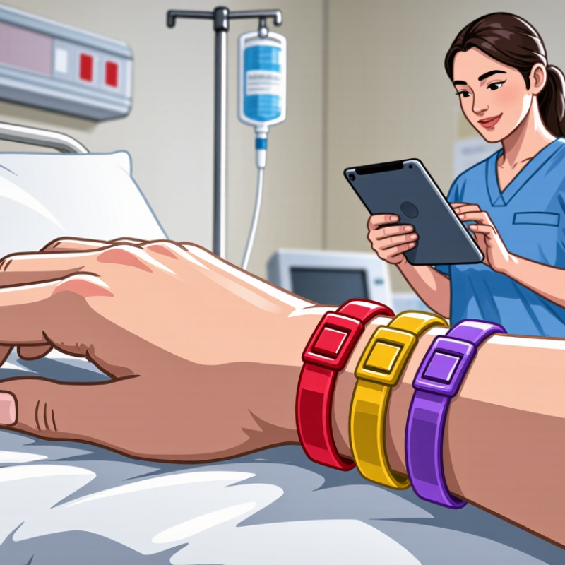
Color coding on medical ID wristbands is a visual language, not a universal medical code.
A red band may indicate an allergy in one hospital, while another facility uses red for a different alert. Yellow can signal fall risk, and purple may indicate a resuscitation preference, but these meanings must be confirmed locally. Color alone is not enough.
The Joint Commission’s National Patient Safety Goals require at least two patient identifiers before care, such as name and birth date. A wristband color cannot replace that check.
The World Health Organization reported in 2017 that medication errors cost an estimated US$42 billion worldwide each year.
Clear wristband communication may reduce confusion, especially during transfers, emergencies, or nighttime rounds. Still, the color is only one layer of protection.
In practice, staff should read the printed alert and verify the facility’s color policy. A red band can look obvious. That confidence may be the danger.
The Pennsylvania Patient Safety Authority has warned that inconsistent wristband colors can create misinterpretation risks. ISO 7010 standardizes many safety symbols, but it does not create one global wristband color system.
I would question any process that relies on memory alone. Small printed text, poor lighting, skin tone, and hurried care can weaken the signal. Use color as a prompt, then confirm the words and the patient’s identity.
Color-coded medical ID wristbands give emergency teams a fast visual signal when seconds matter. A red band may indicate a serious allergy, while a purple band can identify a do-not-resuscitate preference in some healthcare systems. However, meanings vary between facilities. Staff must confirm the color with the patient record and local policy.
These bands can highlight allergy risks before medication is prepared. They may also point to fall risk, communication needs, or limited treatment preferences.
In a crowded emergency room, a bright band can draw attention when the patient cannot speak clearly. The color works like a road sign. It warns, but it does not explain everything.
Clear printing matters too. A nurse should see the label under dim hallway lighting, through gloves, and beside monitoring wires. The wristband must fit securely without restricting circulation. Small details matter. Yet color coding is not flawless. Lighting, color vision differences, faded materials, or unfamiliar hospital standards can cause mistakes. Emergency teams should ask direct questions, check clinical records, and use more than one identification method. A wristband supports professional judgment; it never replaces it.
5 Best Reasons Color Coding Matters on Medical ID Wristbands
Color-coded wristbands can help responders notice urgent health information quickly. People with severe allergies may benefit from a clear allergy alert. A visible color can prompt staff to check the patient before giving medication or food. Individuals with epilepsy may also need rapid recognition during a seizure. Diabetes is another important example, especially when low blood sugar causes confusion, weakness, or unconsciousness. Patients taking blood thinners may need attention after a fall or injury. People with dementia, autism, or communication difficulties can also benefit from an identification color. These signals may explain unusual behavior before someone assumes the worst.
Tips: Use colors supported by your hospital or local emergency system. Add readable words, not color alone. Include the condition, essential medication information, and an emergency contact when appropriate. Check the wristband regularly for fading, loose closures, or unclear printing. Ask a healthcare professional to review the wording. Small details matter.
Color meanings are not universal. A red band may indicate allergies in one setting and something different elsewhere. That weakness deserves honest attention. A wristband should support medical records, not replace them. Choose high-contrast text and durable materials. Make sure the wearer understands the alert, when possible. Caregivers should explain the color system to family members and regular healthcare providers. Clear information remains more reliable than appearance alone.
Color-coded wristbands can make critical information easier to notice during triage, support faster recognition of high-risk conditions, reduce communication barriers, and highlight alerts when a patient cannot speak for themselves. The conditions below represent large patient populations for whom prominent medical identification may be especially valuable.
Estimated global populations: hypertension, 1.28 billion adults aged 30–79; diabetes, more than 830 million adults; asthma, 262 million people; epilepsy, approximately 50 million people; sickle cell disease, approximately 20 million people. Color meanings are not universal, so wristband systems should always follow local clinical policy and include clear text.
Sources: World Health Organization, “Hypertension” (2023); WHO, “Diabetes” (2024); WHO, “Asthma” (2024); WHO, “Epilepsy” (2024); WHO, “Sickle-cell disease” (2024).
Standardized colors on medical ID wristbands help clinical teams recognize urgent information quickly. A nurse entering a dim room may notice a bright red band before reading the patient chart. That visual cue can prompt a pause before medication, treatment, or transport. Clear signals matter during shift changes, emergencies, and crowded admissions areas.
Color systems also reduce confusion between departments. If every unit follows the same approved color meanings, staff can interpret allergy, fall-risk, or special-care alerts more consistently. Written words should remain visible, because color perception differs among people. Labels, symbols, and electronic records provide essential confirmation. Color should support communication, not replace it.
In practice, hospitals need written policies, staff training, and regular audits. A wristband may fade, become covered by clothing, or be applied incorrectly. That weakness deserves attention. Staff should verify the patient’s identity and check the medical record before acting. Local procedures may also differ, so workers must follow their facility’s current standard rather than rely on memory.
A quiet color can carry urgency. Yet careful verification protects the patient.
Color coding matters on medical ID wristbands, but color alone should never carry a critical message. The Joint Commission’s Sentinel Event Alert on colored wristbands warned that inconsistent meanings could create communication risks. Choose a wristband with clear text, readable contrast, and a simple symbol. Add allergies, diagnoses, or emergency contacts only after confirming the information with a qualified healthcare professional. ISO 15223-1:2021 supports standardized medical symbols, but symbols still need local verification.
Maintenance is practical, not decorative. Check the band at every care transition, especially after bathing, surgery, or emergency treatment. Replace it when printing fades, the clasp loosens, or skin becomes red. Use a fit that allows two fingers underneath. Too tight causes discomfort; too loose may disappear under clothing. WHO reports that approximately one in ten patients experiences harm in healthcare, and more than half of that harm is preventable in many settings. A visible, accurate identifier can support safer communication, but it cannot replace patient records or verbal confirmation.
Color systems should match the facility’s written policy. Meanings differ between regions. That is easy to forget. Ask staff to explain the color before relying on it. Review the information with the wearer, caregiver, and clinical team. I would also question labels that appear convenient but lack an update date. A wristband may look professional and still contain yesterday’s mistake. Keep a backup record in a phone or wallet, without exposing unnecessary personal details.
| No. | Why Color Coding Matters | Color or Visual Cue | Typical Clinical Use | Recommended Wristband Information | Selection and Maintenance Tip |
|---|---|---|---|---|---|
| 1 | Faster visual recognition | High-contrast color with clear text | A distinct color can help staff notice an important precaution quickly during admission, transport, handoff, or emergency assessment. | Use a short, standardized message such as “ALLERGY,” “FALL RISK,” or “DO NOT RESUSCITATE,” only when supported by the facility’s policy and clinical documentation. | Choose strong contrast between the band and printed text. Do not rely on color alone; include readable words and, where appropriate, an approved symbol. |
| 2 | Improved communication during handoffs | Consistent color standards | A shared color system can reduce ambiguity when information is transferred among nurses, physicians, therapists, transport staff, and other care teams. | Print the patient’s required identifier according to privacy and facility rules, and pair the alert with the relevant chart entry or electronic record. | Use one written color policy across departments. Because color meanings vary by organization, never assume that a color has the same meaning everywhere. |
| 3 | Support for allergy and safety alerts | Alert color plus plain language | Color-coded alerts can draw attention to allergies, fall risk, infection-control precautions, or other documented safety concerns. | State the specific risk when clinically appropriate, such as the allergen or precaution category, rather than using an unexplained abbreviation. | Verify the alert before applying the band. Replace it promptly if the patient’s status changes or if the printed information becomes unclear. |
| 4 | Better accessibility and inclusiveness | Text, icons, and contrast | Text-based and high-contrast cues remain useful for people with color-vision deficiency, low vision, unfamiliarity with local color codes, or poor lighting conditions. | Use large, legible lettering, simple wording, adequate spacing, and an approved icon when it improves recognition without creating confusion. | Avoid red-green or similar color combinations as the only distinction. Inspect the band under normal clinical lighting before use. |
| 5 | Stronger continuity of identification | Durable, readable design | A well-maintained wristband helps preserve patient identification and relevant alerts through transfers, procedures, and routine care. | Include only necessary information, such as approved identifiers and current alerts. Follow local privacy, consent, and patient-identification procedures. | Check fit, closure, print quality, and cleanliness at routine safety checks. Replace bands that are damaged, wet, soiled, loose, or difficult to read. |
Color provides a quick visual alert about a medical concern. Meanings differ between hospitals and regions. Do not rely on color alone. Read the printed message and confirm the local policy.
No. Red may indicate an allergy in one facility and another alert elsewhere. Check the written words before giving medication or food. That assumption can be dangerous.
Severe allergies, epilepsy, diabetes, and blood-thinner use may need quick recognition. Dementia, autism, and communication difficulties may also benefit. The wristband can explain unusual behavior during an emergency.
No. Staff should verify at least two identifiers, such as name and birth date. The color supports communication but does not replace records or verbal confirmation.
Use clear words describing the condition or allergy. Add essential medication details only after professional review. An emergency contact may help when appropriate. Avoid unnecessary personal information.
Choose durable material, high-contrast text, and a simple symbol. Confirm the design with the healthcare facility. Symbols still require local explanation. A professional appearance proves very little.
Check it during every care transition. Inspect it after bathing, surgery, or emergency treatment. Replace it if printing fades or the clasp loosens. Small failures matter.
Leave enough room for two fingers underneath. Too tight may irritate the skin. Too loose may slip under clothing. Check for redness, discomfort, or disappearing text.
Ask staff to explain the color system. Review the alert with the wearer and care team. Keep a backup record in a phone or wallet. I would still question outdated information.
Color coding on medical ID wristbands provides a fast, clear visual language for communicating important health information. Why is color coding important in medical ID wristbands? In urgent situations, emergency teams may have only seconds to recognize risks such as allergies, fall hazards, limited treatment preferences, or other critical conditions. A consistent color system helps staff notice these warnings quickly, even when a patient cannot speak or provide a complete medical history. It can also reduce confusion and support safer, more efficient decision-making.
Color-coded wristbands are especially useful for patients with severe allergies, diabetes, seizure disorders, communication difficulties, or mobility and fall concerns. When hospitals use standardized colors and confirm their meaning during admission, information can be shared more consistently among nurses, physicians, caregivers, and support staff. However, colors should support—not replace—clear written details and electronic records. An effective wristband should be comfortable, secure, easy to read, and regularly checked for damage, fading, or outdated information. Updating the band whenever a patient’s condition or care preferences change helps maintain reliable communication.